


Westermo (Sweden) - Press Release: Westermo has been on an incredible journey of growth in recent years, expanding both its range of products and global support for our industrial networking solutions. Recent acquisitions of Neratec and Virtual Access have demonstrated our ambition and desire to adapt to meet the needs of different industries. As the world changes, so does the Westermo product offering.
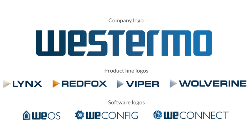
Reflecting these continued developments, we are now making some exciting changes to our brand and visual identity. The Westermo logo and product colour has been in use for more than 40 years, but as of 29th of April we are univeiling new logo designs for the company, products and software, as well as a new product colour. This is the final step in a gradual update to our visual identity that has been taking place over the last few years.
The Westermo brand is synonymous with reliable, high quality technology that is easy to use, and best-in-class customer service. That will not change; Westermo is simply updating its visual identity to better reflect these values.
Product and software logos:
As well as new company logo, Westermo is also introducing new logos for our various product lines and software. The new logos for product lines such as Lynx, RedFox and Viper will follow the updated company visual identity and have a very simple clean design that supports easy application and readability on our increasingly compact products. The logos for our software and services, including WeOS, WeConfig and WeConnect, combine the software name and a unique symbol, and will help to create synergy between our hardware, software and services.
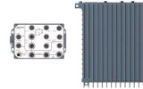
Product colour:
The new steel blue product colour will complement the overall company visual brand identity already used on our website, exhibition booth designs and promotional material. The classic `Westermo brown’ will be very familiar to users of industrial networking technology, but steel blue has been synonymous with Westermo since the company was formed. All new products will incorporate the steel blue colour and most of the current portfolio will transition to the new colour continuously.
Implementation plan:
The Westermo websites and social media channels will adopt the new logos immediately, whilst signage, stationary, business cards, brochures, user guides, data sheets and other promotional material will be updated gradually. All new product launches will incorporate the new visual identity and the majority of the existing portfolio will be updated in phases.


Interested? Submit your enquiry using the form below:
Only available for registered users. Sign In to your account or register here.